Home Inspection Logos: Tips & Resources
Logo design is an area that tends to be neglected in the home inspection industry, though that’s a common trait of small businesses in general.
Many home inspectors don’t have any logo at all, and it’s very easy to find home inspection companies with impractical logos that look like clip-art from over a decade ago.
Why is this? I believe it comes down to two factors:
Cost: Custom logo design that is any good tends to be expensive. Many businesses invest thousands of dollars, sometimes even tens of thousands, in their logo and their brand identity. For a smaller business like yours, especially if you’re a one-person show, those numbers just aren’t realistic.
Effort: Good design sense isn’t something we’re born with. Not to mention the skills and software required to turn an idea into something that you can actually use. And what if, like most people, you don’t have a clear vision for a good logo? Where do you even start? Finding a good logo designer in your price range isn’t a simple matter. I’ve seen many inspectors spin their wheels trying to come up with a logo, wasting weeks or months that would have been better spent practicing or marketing.
The good news here is that the bar is low, making it easy to stand out with just a small investment and a little bit of effort.
My goal here is to help you avoid getting stuck at the logo phase and keep your momentum pressing forward. I’ll do my best to help you understand why you should have a logo at all. I’ll even provide you with a quick primer on logo design to help you avoid some common mistakes. Finally, I’ll give you some recommendations to point you in the right direction to either create your logo yourself or to find a designer who will create a custom logo.
If you’re here looking specifically for the logo design services that I recommend, then feel free to jump straight to “Creating a home inspection logo.” However, there is a lot of information in this article that you may find helpful before diving into the process. I strongly recommend taking the take to read through it.
The importance of having a logo
First, I’d like to talk a bit about why you should have a logo in the first place. I won’t go into much detail for many of these reasons because they’re either self-explanatory or have been thoroughly covered elsewhere. However, there are a few reasons that I don’t see discussed very often, but in my opinion, are very important.
First Impressions
For many, your logo will be the first aspect of your business that they notice. Be careful, as a very poor logo can do more harm than good here.
Professionalism
Your logo can help people to see you as a true professional, before they’ve ever met you. This is especially applicable in areas without license requirements and can separate you from the amateurs.
Be remembered
Humans are visual creatures. A potential client may have trouble separating you from other inspectors because your company doesn’t have a visual identity, and thus there is little to remember you by.
Reinforce brand personality
Your brand is not required to have a specific personality, such as being cheerful or humorous. But if this is the case, then your logo can really help to establish that feel if it’s done well.
Build trust and loyalty
Without a logo, or with a very poor logo, potential clients are left with the impression that you aren’t willing to invest in your own company. So why should they invest in you?
Additionally, repeated exposure to your brand, so long as it is consistent, breeds familiarity — and familiarity breeds trust.
Ultimately, your logo acts as a single point, a visual anchor of sorts, for the experiences and feelings that individuals have with you and your company. If you can keep these feelings and interactions positive, then you can build trust and loyalty with your clients and with your referral sources.
Design considerations for your home inspection logo
If you’re going to be designing a logo yourself, or if you’re going to use a DIY service like the ones I’ll talk about later, then it’s important to understand some basic concepts of effective logo design. Having a general understanding of logo design will help you avoid a lot of common mistakes. You might even start to notice some of these mistakes in the logos of small businesses all around you.
Simplicity
The first rule of logo design is that it should be simple. A stranger who is seeing your logo for the first time should be able to quickly and effortlessly tell what they’re looking at. They should immediately understand that it is a logo. They should be able to quickly and easily identify the text and make out what it says. So how does one accomplish this level of simplicity? I have a few recommendations:
1. Limit your colors
Keep your color choices down to one or two colors. Of course, there are designs out there that lend themselves to a colorful palette, but if you don’t know what you’re doing then stick to just one or two. We’ll talk about specific colors later on.
2. Focus on one thing
Logos typically consist of the company name and a graphical shape or object, called a symbol. In the home inspection industry, this symbol is usually a house, a checkmark, a magnifying glass, or some combination thereof. Trying to use multiple graphics is a recipe for disaster, and combining more than two is extremely difficult to do well. You might go with a house and a checkmark, or a house and a magnifying glass, but do not attempt all three. Even if you do choose to use two objects, like the house and magnifying glass, you’ll need to combine them together into one coherent symbol that is easy to make out.
3. Use a legible typeface for the text
It isn’t uncommon to see an obscure typeface, or font, used in a logo to add character. The intention is typically for the text to look fancy, hand-written, vintage, or playful. However, this extra character often comes at the cost of legibility. Save yourself the headache and keep it simple. If you really want to play it safe, then you should limit your choices to standard typefaces such as Arial, Tahoma, Open Sans, Proxima Nova, Helvetica, Garamond, Futura, and similar.
Practicality
The second rule of logo design is that it must be practical. A logo can be used in any number of sizes and contexts. While you probably don’t have to worry about how your logo is going to look on a billboard, you may have to consider how it would look on the side of your vehicle, on a website, on a business card, or even on the side of a pen. Not getting this right can come back to bite you later on when you need to pay for someone to recreate your logo in the proper format or start over from scratch. Here are some tips to make sure you can actually use your logo when the time comes.
1. Use printable colors
The way colors work in print is different from the way colors work on your computer screen. On a digital screen, the color is made up of light, specifically RGB (red, green, blue) light. In print, the color is made up of pigments, which consists of CMYK (cyan, magenta, yellow, black) colors. What this means for you is that colors may not print exactly the same as what you see on your screen. In fact, there is a range of colors that can be created on a computer screen that cannot be produced in commercial printing processes. If you’re designing your logo yourself, then make sure you’re using software that can create documents in CMYK color mode. Stay away from highly saturated (pure) colors and be especially careful with blues and greens.
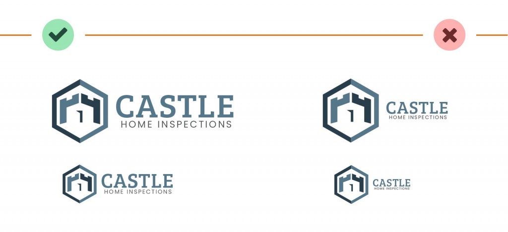
2. Make sure the design is readable at small sizes

One problem that I see over and over again is where the text is too small compared to the symbol. The logo is designed at a larger size, where everything looks fine. However, as soon as you scale the logo down to fit into a website header, or something similarly small, you run into an issue. The logo symbol looks fine, but the text is absolutely tiny. What good is a logo if you can’t make out the name of the company? This also applies to the logo symbol. It’s important to make sure that the lines and spaces in the symbol design are thick enough to be visible at small sizes. Otherwise, you’ll lose that definition and end up with a blurry mess instead.
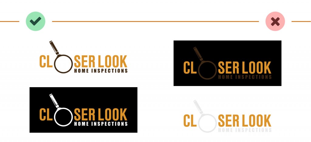
3. Your logo should be readable on both light and dark backgrounds

You can’t always predict the contexts that your logo will show up in. Most of us would design our logos on a white background. It’s easy enough to make sure to use a white background for the website and business cards. But what if you need to make some decals that go no your car window? Or what if you need to display your logo on top of a darker photo? In some cases, a logo can be designed to stand out in both of these situations. In other cases, you should have different versions of your logo: one for use on a light background and an inverted version for dark backgrounds.
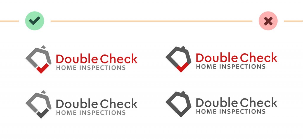
4. The design should still work if it’s displayed in only one color

Ideally, you should still be able to make out your logo if you strip away all of the colors. You may never run into this problem, but some situations may call for your logo to be printed in only one color. This would usually be white or black. If your logo relies on gradients or contrasting colors to define its shape, then you’ll lose that definition.
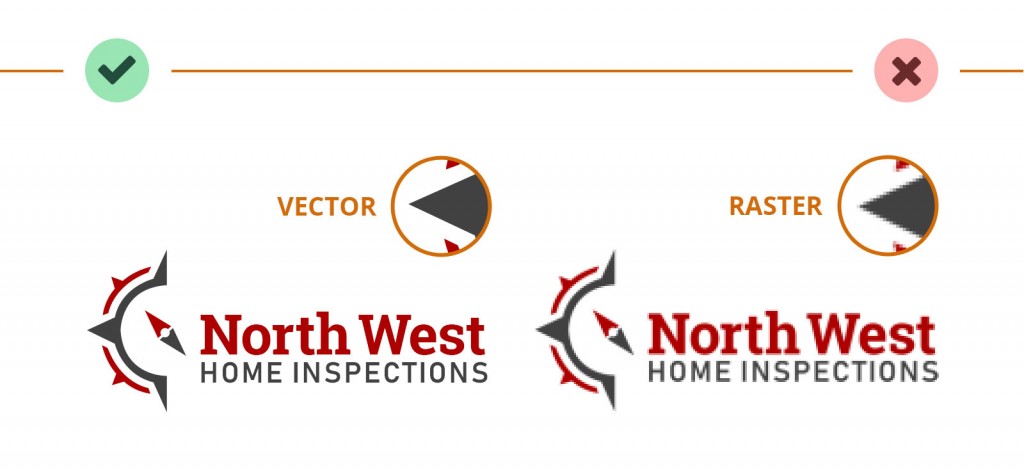
5. Your logo should exist in a vector (scalable) format

If you want to look professional, then you need to have your logo in some kind of scalable vector format. A normal image, such as a JPEG, PNG, or GIF consists of pixels. Pixels are the little blocks that make up the graphics on your screen. These formats are called raster graphics. If you take a JPEG and make it smaller, then you’re fine. However, if you make it significantly larger the computer has to make a guess to fill in the new pixels, resulting in a blurry logo.
Vector graphics, on the other hand, don’t store the image as a bunch of pixels. Instead, they store the image as a series of points and lines. When you scale up a vector graphic, the computer has all the information it needs to redraw the image. This results in a clean and professional look, whether it’s printed on a brochure or a billboard the size of your house. Vector formats include EPS, PDF, and AI files. These are what other companies will generally ask for when creating printed materials, shirts, decals, and so on.
Choosing Colors
If you are going to be selecting your brand colors on your own, then this information might save you some time and hassle. I might cover brand color choices more thoroughly in the future, but for now I’ll make some recommendations for what to avoid and provide you with a few options to find the right colors for you.
Some things to avoid
Highly saturated colors
As I mentioned earlier, colors work differently for commercial print than they do on your computer screen. CMYK, the colors used for print, have a more limited range than what you can see on a monitor, phone, or other screens. In order to play it safe, I recommend staying away from highly saturated colors, especially blues and greens. Otherwise, you may end up with less vibrant colors than you expected. If you use something close to pure blue, then it’s going to less vibrant when you print it. You also need to be very careful with blue to make sure you don’t end up with something that looks purple when printed. When in doubt, lean more towards a light blue (cyan) than a true blue.
Overly bright colors
When choosing your brand colors, I recommend staying away from super bright colors. The first reason for this is contrast. It’s important that you can easily distinguish your logo and text from the background, which will normally be white. High contrast means it’s easy to read and easier to recognize. A bright yellow, pale blue, or similar colors may not provide enough contrast. The second reason is that, in my experience, brighter colors are more difficult to work with. If your color choices are working against you, then even a great designer will struggle to make your website and marketing materials look good.
Overused colors
Another thing to avoid when picking your colors is overused combinations. By far the most common colors I see in this industry are red, white, and blue. I recommend trying different ideas and thinking outside the box a little bit. A little further down I’ll show you how to come up with some color combinations on your own. In the meantime, unless you’re already set on a particular color, start thinking about some less common options. Maybe try earth tones (browns with orange or green), teal or turquoise, purple, or even minimalistic shades of dark gray or black.
Choosing your colors
Working with colors can be very difficult if you don’t have much experience with it. I shudder every time I think about my color choices early on in my career. Not to mention the hours of frustration failing to come up with color choices that were up to my standards. Save yourself the trouble and don’t try to come up with colors purely on your own. Instead, I recommend piggybacking off the experience of professional designers.
Benefit from the experience of others
There is nothing wrong with looking to other professionally-designed logos to inspire your color choices. While there is something to be said about understanding why those colors work well, it isn’t critical that you do. This can be super helpful if you have a vague idea of what you want your colors to be, but nothing you come up with is working particularly well. Looking at logos with similar colors designed by someone with years of experience can help steer you in the right direction. Here are some great places to start:
- LogoMoose – A logo inspiration website.
- LogoSpire – Another logo inspiration website.
- LogoPond – Yet another logo inspiration website
- Logo Inspiration – The name may not be creative, but you can filter by color.
- Color combinations blog post on Looka.com. I’m not a fan of their logo design service, but this particular post has some great ideas.
Creating a home inspection logo
Now that you’ve had a quick primer on logo design, it’s time to look at some options for actually creating your logo. These days you have two choices: You can either create a logo yourself with the use of online do-it-yourself tools, or you can hire someone to create a logo for you.
DIY logo services
The DIY tools have come a long way in recent years, and they are a great choice if you just need something professional but don’t have the budget or skillset for something custom. All of these tools offer vector files necessary for print work. Many of them also offer an option to buy out the logo, preventing anyone else from buying the same design in the future.
Here are a handful of the best self-service logo design tools that I’ve come across:
Brand Crowd
- $45 for the basic package including vector files for print work.
- Buyout option for an additional $145.
- Several professional-looking logo options with a real estate theme.
- Easy-to-use interface for editing your logo.
- Keep track of your favorite designs as you browse.
DesignEvo
- $24.99 base package — pixel graphics only.
- $49.99 package including vector files as well as font files.
- Simple but capable editing features.
- Keep track of your favorite designs as you browse.
Logo Genie
- $24.90 base package — high resolution but no vector files.
- Additional $14.40 for vector files.
- Buyout option for an extra $144.
- Many professional-looking logo designs with a real estate theme.
- The interface is easy to use while also quite powerful. The extra power comes with some added complexity.
Free Logo Services (not actually free…)
- $24.99 base package — pixel graphics only.
- $49.99 package with vector and font files.
- Simple but capable editing features.
- The interface and some of the designs are dated, but it’s worth a look.
LogoDesign.net
- $39 base package — logo with vector files
- Personally, I would avoid the other packages. They just include extras that you would be better off getting elsewhere.
- A bit rough around the edges, but it’s pretty simple when you get the hang of it.
- Customization is a bit limited for many of the designs.
Custom logo design services
If you having something specific in mind or if you want something more unique, then a custom professionally-designed logo is the way to go. This will also be the case if you have a much larger budget. The cost of a custom logo for a small business can range from a few hundred dollars into the thousands, so be prepared to shell out a decent amount of cash if you want something good.
You aren’t limited to local graphic design shops in today’s interconnected world. You’re free to work with digital agencies all over the world. This means that finding the right designer or agency can be rather intimidating. If you have a high budget, then I strongly recommend that you take the time to do your research. Browse around online to check out different agencies. Pay attention to their previous work and make sure that their style and quality is in line with what you’re looking for.
If you need a custom logo but are still on a tight budget, then there is one other option.
Freelance marketplaces
If you’re on a tight budget and not sure where to start, then a freelance marketplace could be a great option. These websites act as a sort of medium where businesses and individuals such as yourself can find freelancers with the specific skillset needed for a project. Each of the websites below handles this process in different ways, but each are used by thousands of designers.
A word of caution
While plenty of great designers and other freelancers use these marketplaces, there are also many subpar freelancers also using the same service. The overall quality of the end product, professionalism, and pricing are all hit-or-miss. These websites also cater to freelancers all over the world, so quality of communication could also be shakey.
Make sure to do your own due diligence before agreeing to hire any individual. Look at their previous work and check out their reviews. If their earlier work isn’t up to your standard or isn’t in a style that you like, then they may struggle to come up with something that you’re satisfied with. If the freelancer doesn’t seem to be able to communicate very well then you’ll be in for a rough time. If their prices are very low, then they’re low for a reason. In any of these cases, it isn’t worth risking your time. The last thing you want is to postpone starting your business because the logo is taking longer than you expected.
Freelancer.com
- Free registration and job posting
- Choose from proposals from multiple designers
- Search for designers by country
- Designer profiles with reviews, rate, and portfolio
- Real-time chat
- Fixed-price or hourly price options
- Milestone-based payment option
Upwork
- Free registration and job posting
- Choose from proposals from multiple designers
- Search for designers by country
- Designer profiles with an overall score, number of projects, reviews, and portfolios
- Real-time collaboration tools (chat, video, project tracking)
- Fixed-price or hourly price options
99 Designs
- Money-back guarantee
- Uses “design contests” instead of proposals
- Option to search for your own designer
- Fixed-price packages
Fiverr
- Low starting prices, but can climb from there
- Search by budget and delivery time
I would love to hear your thoughts
Have you recently been through the process of creating your logo, whether through these options or something else? I’m very curious to hear about your experience, good or bad. If you read this article before getting your logo, then I would love to hear about your experience and whether or not this was helpful.


2 Comments
Todd says:
March 18, 2021 at 7:47pmRicky, This was incredibly helpful. This blog essentially answered all the questions I didn't know I had in order to get my branding started. Direct and to the point. I selected some content with a name, emailed it off to someone local and hope to have a foundation to move forward with my website.
Thanks again,
Todd M.
Ricky Schumacher says:
April 18, 2021 at 9:35amHey Todd,
I'm a bit late the party here, but thanks for the comment! I'm just glad to help. Let me know if you have any questions about anything.